.png)

Online Invoicing website for business owners and freelancers on the go

Many small business owners and freelancers struggle with managing invoices efficiently. They often rely on outdated spreadsheets, manual tracking, or costly software that doesn’t fit their needs. Through this research, I aim to understand their pain points and create an intuitive invoicing solution that simplifies the process, reduces errors, and improves payment tracking.
Project Background
The Product
With a clean, easy-to-use interface and powerful features, you can create and send professional invoices in minutes, track payments in real-time, and manage client information all in one place. Whether you’re at your desk or on the go, INVOZE helps you stay organized and in control.
My Role
Lead UX Researcher & UX Designer
Project Duration
2 Months

Understanding the User
-
User research
-
Personas
-
Problem statements
-
User journey map
-
Competitor analysis


User Research
For this project, I created personas, built user journey maps, and conducted competitor analysis to better understand the invoicing needs of freelancers and small business owners. Initially, I assumed that most users were primarily concerned with pricing and customization features in their invoicing tools. However, after doing research, I realized that simplicity, speed, and automation were far more important. Many users struggled with tracking payments and follow-ups due to time constraints and lack of technical confidence, which shifted my focus toward building a simple, user-friendly solution.
1
Manual Invoicing is time-consuming
Reinforces the need for a fast, template-based invoicing system that users can access and complete in just a few taps, especially from a mobile device.
2
Difficulty tracking payments
The design will include a clear dashboard with real-time payment statuses and automatic reminders, reducing the need for users to manually track anything.
3
Complex software is overwhelming
This pain point will guide the interface toward a clean, minimal layout with simplified language and only essential features, making it accessible for non-tech-savvy users.
4
Forgetting to follow up on unpaid invoices
This insight emphasizes the importance of integrating automated follow-up features, such as scheduled payment reminders and status alerts, to help users stay on top of their cash flow effortlessly.
Pain Points
Brainstorming

.jpg)
.jpg)
I developed key "How Might We" questions and generated targeted solutions for the most critical ones.
Personas
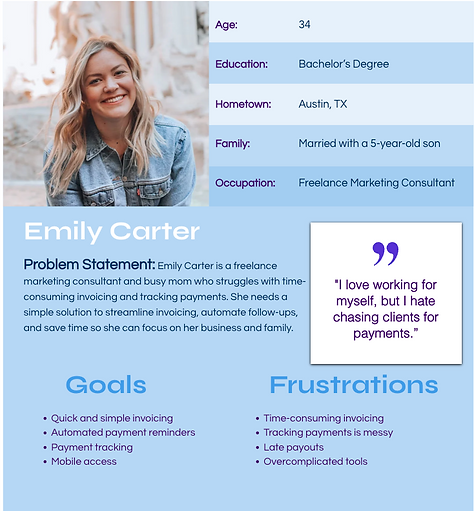
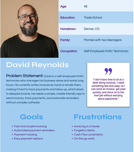
I created user personas based on research to represent key user types, their goals, and pain points. These personas guided design decisions and helped keep the experience focused on real user needs throughout the project.
User Journey Map
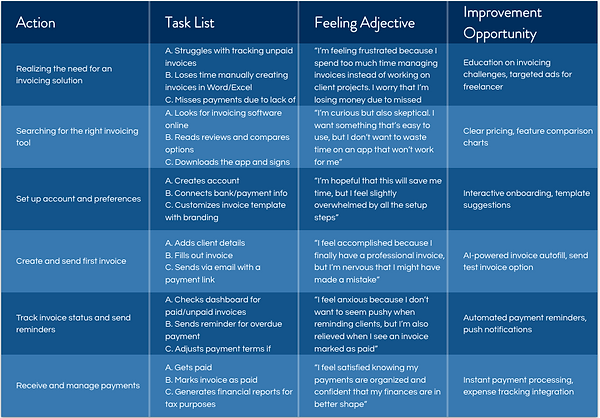
The user journey map illustrates the steps users take to achieve their goals, highlighting key actions and feelings along the way. It helped identify opportunities to improve the experience and design a smoother, more intuitive flow.
Competitor Analysis


Overall, the platform offers a more limited set of features, with the option to upgrade for advanced functionality. It’s well-suited for smaller businesses and freelancers who don’t require a wide range of tools. However, it may be too basic for larger companies with more complex financing needs. Additionally, the platform is only available in the U.S. and Canada, has limited accessibility features, and is currently offered only in English.


Overall, the platform offers a wide range of powerful financing features, making it well-suited for businesses with complex accounting needs. However, it may be overwhelming for small business owners or freelancers due to its robust toolset. The extensive functionality results in a crowded interface, which can feel intimidating for first-time users.
Starting the Design
-
Site map
-
Digital wireframes
-
Low-fidelity prototype
-
Usability studies

This site map outlines the structure of INVOZE, highlighting the flow between key sections of the website for clear navigation and streamlined user experience.
Digital Wireframes & Low-fidelity Prototype

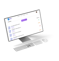
Initial wireframe of the desktop version of INVOZE's website. These wireframes include the key pages a user would navigate while creating a sending a new invoice.
First Iteration lo-fi prototype of the desktop version of INVOZE's website. This prototype maps out the user flow process of creating and sending an invoice.

Usability Study Insights
Problem:
Users were frustrated that they had to repeatedly fill out their personal information
Solution:
Add an option to save information for future use
Problem:
Users were annoyed that their invoice could not be viewed in its entirety without having to scroll
Solution:
Adjust the screen layout so that the whole invoice can be viewed without scrolling


In earlier iterations, users had to scroll to view the full invoice, making it difficult to grasp the overall layout. To address this, the layout was adjusted to display the entire invoice more clearly within the visible screen area.

An option was added to save user information, allowing for a faster and more seamless experience in future sessions.
Refining the Design
-
Mockups
-
High-fidelity prototype
Mockups & High-fidelity Prototype
%20copy.png)
These mockups and high-fidelity prototype of the INVOZE desktop website highlight the core philosophy behind the platform: simplicity. The clean, minimal design reflects the ease of use built into every function. There is no clutter, no confusion, just straightforward invoicing. From creating to sending and tracking invoices, every step is intuitive, making INVOZE perfect for users who want powerful tools without the learning curve. What you see is what you get: easy invoices, done right.

Key Takeaways
-
Small enhancements have a big impact
-
Less is more, keep the interface focused and intuitive
-
Iterative design leads to better outcomes