.png)

Instant Invoicing app for business owners and freelancers on the go
Project Background
Many small business owners and freelancers struggle with managing invoices efficiently. They often rely on outdated spreadsheets, manual tracking, or costly software that doesn’t fit their needs. Through this research, I aim to understand their pain points and create an intuitive invoicing solution that simplifies the process, reduces errors, and improves payment tracking.
The Product
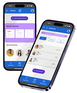
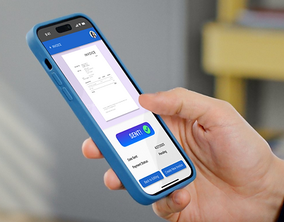
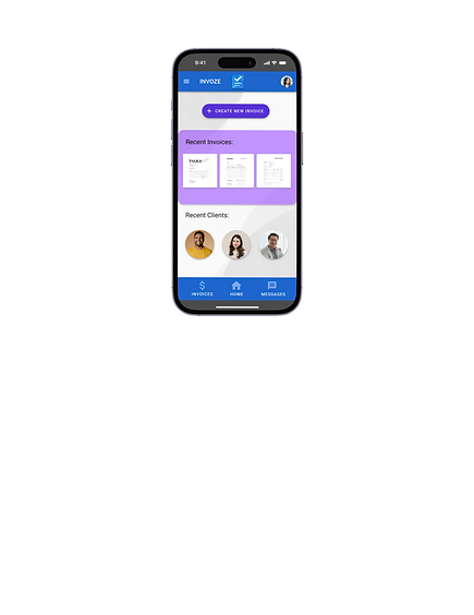
With a clean, easy-to-use interface and powerful features, you can create and send professional invoices in minutes, track payments in real-time, and manage client information all in one place. Whether you’re at your desk or on the go, INVOZE helps you stay organized and in control.
My Role
Lead UX Researcher & UX Designer
Project Duration
2 Months
Understanding the User
-
User research
-
Personas
-
Problem statements
-
User journey map


User Research
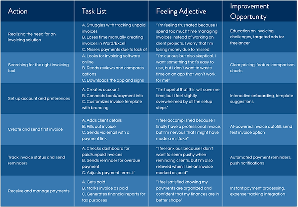
For this project, I created personas, built user journey maps, and conducted competitor analysis to better understand the invoicing needs of freelancers and small business owners. Initially, I assumed that most users were primarily concerned with pricing and customization features in their invoicing tools. However, after doing research, I realized that simplicity, speed, and automation were far more important. Many users struggled with tracking payments and follow-ups due to time constraints and lack of technical confidence, which shifted my focus toward building a simple, user-friendly solution.
1
Manual Invoicing is time-consuming
Reinforces the need for a fast, template-based invoicing system that users can access and complete in just a few taps, especially from a mobile device.
2
Difficulty tracking payments
The design will include a clear dashboard with real-time payment statuses and automatic reminders, reducing the need for users to manually track anything.
3
Complex software is overwhelming
This pain point will guide the interface toward a clean, minimal layout with simplified language and only essential features, making it accessible for non-tech-savvy users.
4
Forgetting to follow up on unpaid invoices
This insight emphasizes the importance of integrating automated follow-up features, such as scheduled payment reminders and status alerts, to help users stay on top of their cash flow effortlessly.
Pain Points
Personas
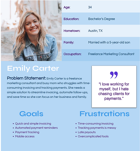
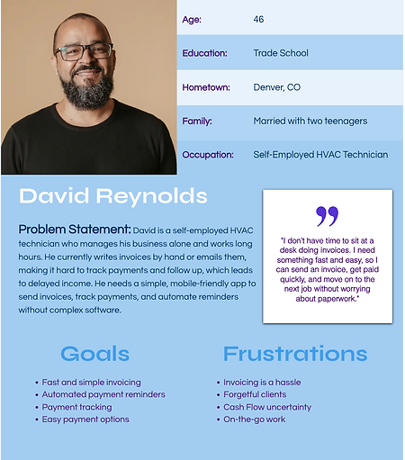
I created user personas based on research to represent key user types, their goals, and pain points. These personas guided design decisions and helped keep the experience focused on real user needs throughout the project.
User Journey Map
The user journey map illustrates the steps users take to achieve their goals, highlighting key actions and feelings along the way. It helped identify opportunities to improve the experience and design a smoother, more intuitive flow.
Starting the Design
-
Site map
-
Digital wireframes
-
Low-fidelity prototype
-
Usability studies

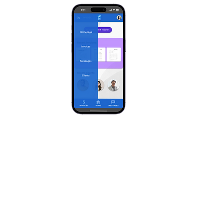
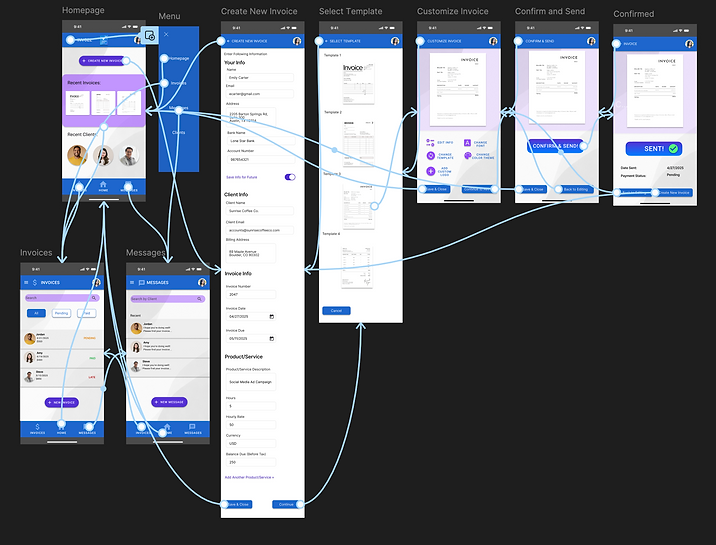
This site map outlines the structure of INVOZE, highlighting the flow between key sections of the app for clear navigation and streamlined user experience.


Usability Study Insights
Problem:
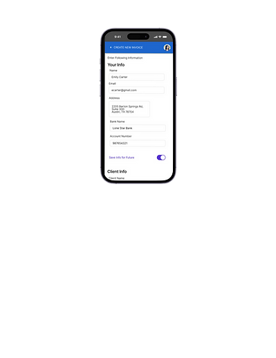
Filling out the invoice information felt overwhelming and disorganized
Solution:
Form should be broken up into sections to reduce cognitive load and keep information organized
Problem:
Users felt frustrated with how many buttons needed to be clicked to get to their invoices
Solution:
Simplify the navigation by grouping related content and add more shortcuts
Problem:
Users found some features to be unnecessary and distracting
Solution:
Stick to having features that solve the main problems of the user: creating, sending, and tracking invoices
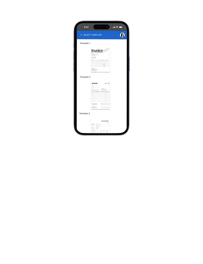
Problem:
Users felt overwhelmed by the number of template options and struggle to choose the right one
Solution:
Limit the number of template options or highlight recommended ones
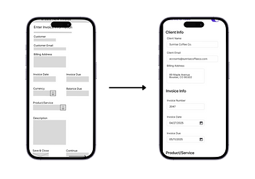
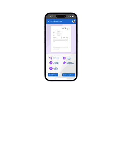
The form is divided into clear sections to better organize information and guide users through the input process.
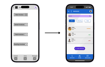
Navigation was streamlined by introducing shortcuts to frequently used features, allowing users to access key sections more efficiently
Refining the Design
-
Mockups
-
High-fidelity prototype
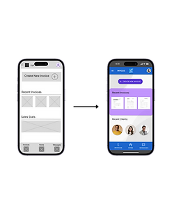
Mockups & High-fidelity Prototype
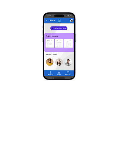

I created high-fidelity mockups to visualize the final design and ensure consistency in layout, color, and typography.
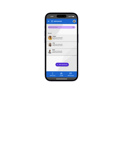
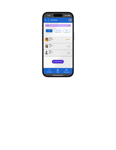
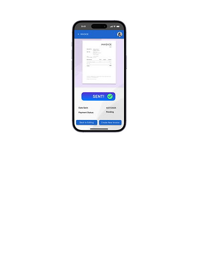
This high-fidelity prototype showcases the final design of INVOZE, featuring polished visuals, branded UI, and interactive flows ready for testing and developer handoff.
Try out my Hi-fi prototype
Key Takeaways
-
Efficient navigation matters
-
Less is more, keep the interface focused and intuitive
-
Iterative design leads to better outcomes